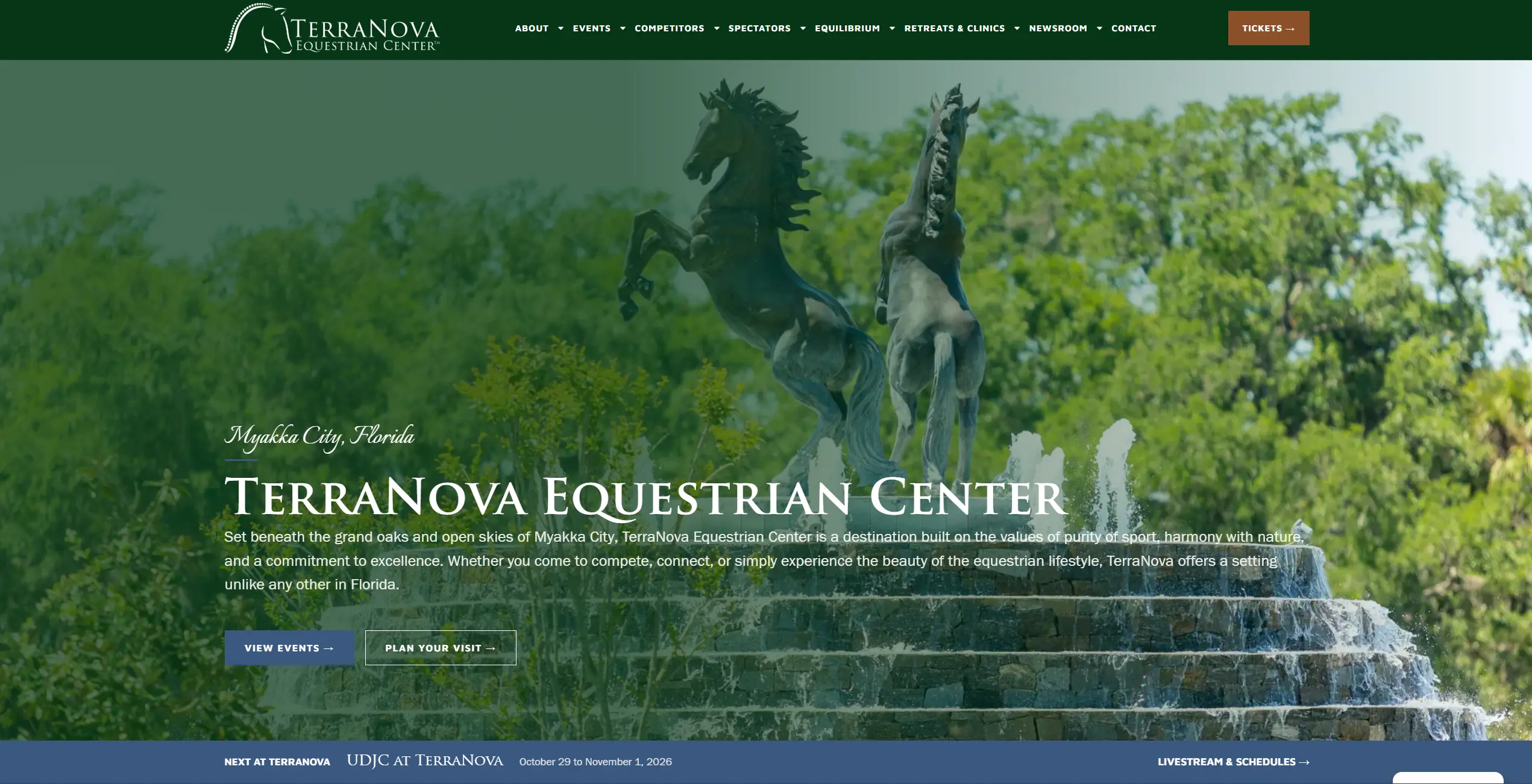
From a brochure site to a working tool for a 200+ acre showground. I redesigned and rebuilt the TerraNova Equestrian Center website to help competitors, spectators, sponsors, and prospective residents navigate a complex destination and take the next step—without hunting across disconnected pages and services.
Client: TerraNova Equestrian Center, Myakka City, Florida
Role: Contract website design and development (full rebuild)
Project partner: HCP Associates, responsible for work outside website design and development
Engagement: August–September 2026
Technology: WordPress, Elementor, ACF, custom post types, PHP, and JavaScript
Live site: terranovaequestrian.com ↗
The problem: a venue website that needed to do more
TerraNova is a 200+ acre equestrian venue with six all-weather arenas, more than 250 permanent stalls, on-site cabins, and an RV campground. Its competition program spans five disciplines: dressage, eventing, show jumping, hunters, and combined driving.
Its earlier website was primarily informational. That was a problem because people visit a destination like TerraNova with specific tasks, not just to read about the venue.
- Competitors need show dates, stabling, health-record requirements, lodging, and trailer-parking information.
- Spectators need admission and parking details, seating, amenities, and guidance for children and pets.
- Sponsors and vendors need to understand the opportunity and find a direct route to getting involved.
- Potential residents and boarders need connections to related TerraNova brands, including The Estates, The Stables, and Equilibrium.
Several tasks happen on external platforms, including LeapEvents for ticketing, Jotform for cabin and RV enquiries or reservations, EquiTrace for health records, and an outside vendor for golf cart leasing. The new website needed to connect visitors to the right service at the right moment, rather than force them to figure out where to go next.
The brief: redesign and rebuild the site around those visitor journeys, so each audience could find the right information and complete its task with fewer steps.
The design decision: organize around visitors
I built the information architecture around who is using the website rather than only the facilities the property owns. The primary navigation follows six audience-oriented destinations: Events, Competitors, Spectators, Equilibrium, Retreats & Clinics, and Newsroom. A persistent Tickets call to action sits outside the menu to keep that high-priority task visible.
The homepage uses the same principle immediately after the hero, directing visitors into three paths: Spend a Day at the Show, Compete at TerraNova, and Live the TerraNova Lifestyle. Each path ends with practical actions rather than a generic “Learn more” link.
What I designed and developed
1. A structured events system and calendar
The event experience works as a schedule, not a manually curated collection of blog posts. Staff can publish an event once and have its information appear across the season listing, filtered views, and calendar.
- A full-season event listing covering October 2026 through May 2027.
- Filters for Combined Driving, Dressage, Eventing, Hunter/Jumper, and Others.
- A month-by-month calendar with shareable month URLs, allowing visitors to open a specific month directly.
- Year-based event paths such as
/events/2026/...to distinguish recurring shows across seasons. - A “Next at TerraNova” feature in the homepage hero for the next timely event.
The underlying WordPress content model uses custom post types and ACF, with reusable layouts so the team does not have to duplicate event entries or design each event page individually.
2. An interactive property map
For a property spanning more than 200 acres, a static address cannot answer every “Where do I go?” question. I created a filterable property map where visitors can select markers and view details for locations such as arenas, barns, the pavilion, and lodging. The experience makes navigation around the venue part of the website instead of leaving it entirely to phone calls or on-site staff.
3. A practical competitor resources hub
The Competitor Resources page brings the main parts of a show-week visit into one place: arenas and footing, stabling, health requirements, guest cabins, the RV campground, partner hotels, pavilion seating, and golf cart leasing.
Each relevant section points to the service where the task is completed—whether that is a reservation form, health-record upload, ticketing service, or vendor website. These are integrations through purposeful links and workflows, not claims that I developed the third-party platforms themselves.
4. A spectator guide built around the visit
Spectators receive a practical guide to arriving, parking, and enjoying the show. It covers seating, clothing, food, the boutique, restrooms, accessibility, children, and pets. Essential details—including location, free admission, free parking, and contact information—are presented together for visitors who need a quick answer.
5. A newsroom that stays current
I separated show recaps and competition results from press releases, helping visitors find updates without mixing them with official announcements. Recent show results feed into the homepage, reducing the need to manually update it after each competition.
6. Related brands and sponsor discovery
The website connects TerraNova with its wider brand family: The Estates, The Stables, Equilibrium, and The Myakka Initiative. This lets visitors discover residential, boarding, and related experiences without losing their place in the main venue journey.
Around 50 sponsors and partners are presented in three tiers—Major, Official, and Media & Community—with routes for prospective sponsors and vendors to enquire.
7. A consistent, responsive technical foundation
- Custom page and content templates built in WordPress and Elementor, supported by PHP and JavaScript where needed.
- Individual page titles, meta descriptions, and Open Graph sharing data.
- WebP imagery and descriptive alternative text for photography and sponsor logos.
- A cookie consent manager.
- Responsive desktop, tablet, and mobile layouts, including a dedicated mobile navigation experience that keeps the Tickets action visible.
8. A publishing workflow the team can run
Every page and template was designed for the project rather than assembled from stock theme layouts. The back end uses structured content so TerraNova staff can publish events, show results, and press releases without requiring a designer to rebuild the layout each time. Editors enter the content once; the appropriate cards, listings, and detail pages handle how it appears.
Design direction: let the property lead
TerraNova’s visual positioning reflects the idea that “the land came first”—the show barns were situated with care for the existing oak trees. I used a photography-led presentation with earthy greens, cream, navy, and generous spacing to give the site a sense of the place, rather than the feel of a generic events platform. The visual language extends into the related-brand sections so those experiences feel connected.
Outcome: from brochure to useful platform
The principal change was functional. Where the previous website mainly described TerraNova, the new experience helps competitors plan a show week, spectators plan a day out, and sponsors find a route to participate. It also gives the TerraNova team structured ways to publish new information throughout the event season.
My contract scope covered the full website redesign and development during August–September 2026. HCP Associates handled responsibilities outside design and development, including analytics, marketing, and post-launch reporting. I am not claiming traffic, conversion, attendance, or revenue gains without verified measurements.